OVERVIEW
National Geographic is a media powerhouse, but its TV app struggles to engage younger viewers. While 38% of US adults tune in, the channel skews heavily towards the 55+ demographic, and only 6% prefer streaming to live TV.
This project tackles this gap by revamping the app for a modern audience.
STRATEGY
While auditing their digital products, I found several issues:
• No motion or interactive experiences; hovering over navigation tabs doesn't activate/load content
• Digital landing pages don’t use video to preview content or draw users in
• Current interface largely promotes male-skewing reality shows
• Users can’t browse by category
• Lack of clear organizational or hierarchical order making it difficult to find content
• Little differentiation between documentaries and TV series
This project tackles these challenges head-on, crafting a visual design strategy that celebrates National Geographic's mission while engaging a new generation of explorers.
PROJECT GOALS
1. Increase user engagement through immersive storytelling: entertain and compete with the likes of Netflix and Hulu; modernize the brand
2. Promote original, diverse programming and content discovery with better information hierarchy: highlight current programs with a focus on diversity and inclusion; showcase original and award-winning stories; provide a clear structure and order for content on the screen
3. Develop meaningful connections with users for longer retention: draw viewers in with an aesthetically interesting interface; make emotional connections with autoplay videos; create a sense of belonging with enhanced personalization
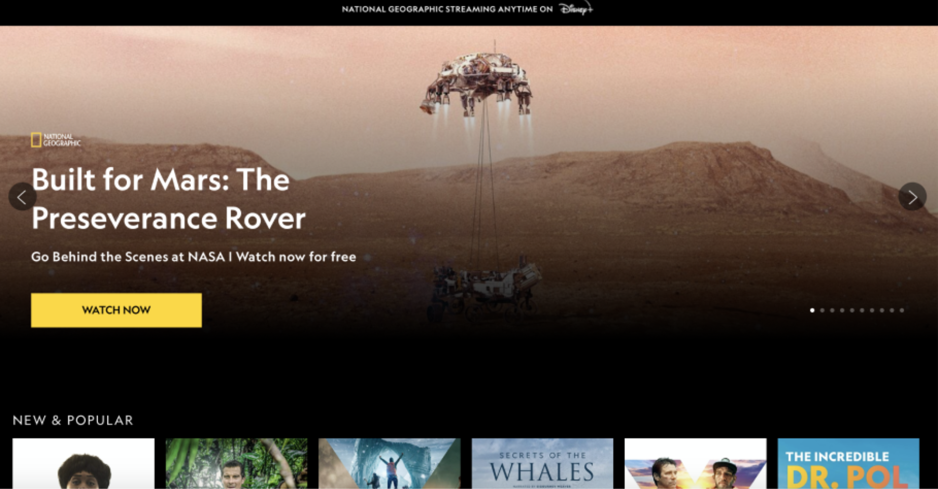
Current Landing Screen
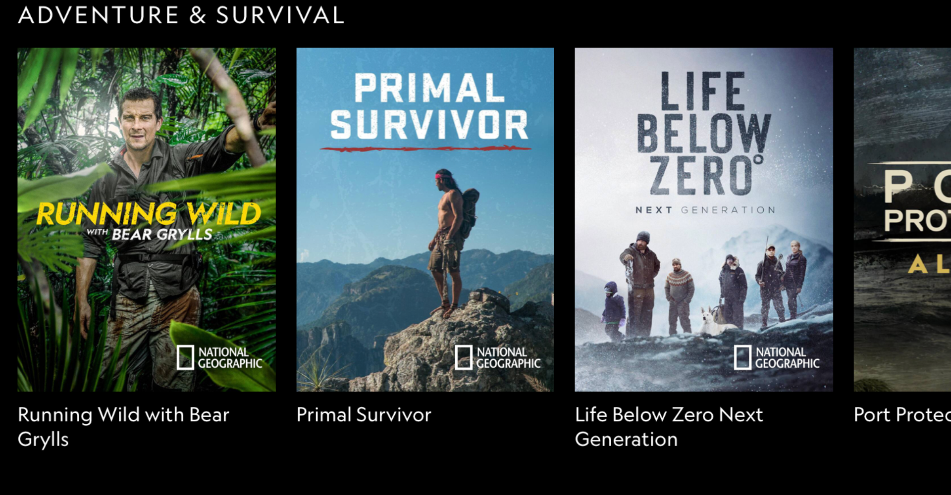
Program Screen
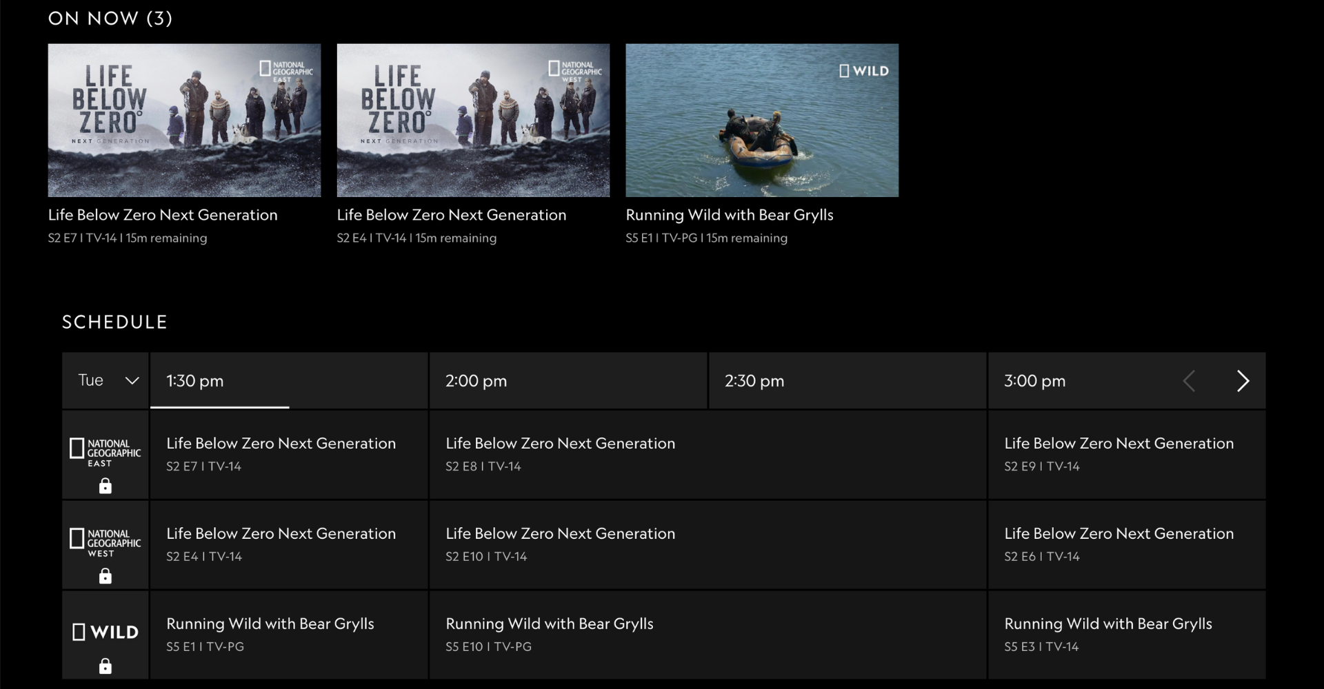
TV Schedule Screen
VISUAL DESIGN STRATEGY
UI interactions – improve app functionality with clear UI interactions, such as active states
Content hierarchy – create a visual hierarchy to distinguish between sections and content type
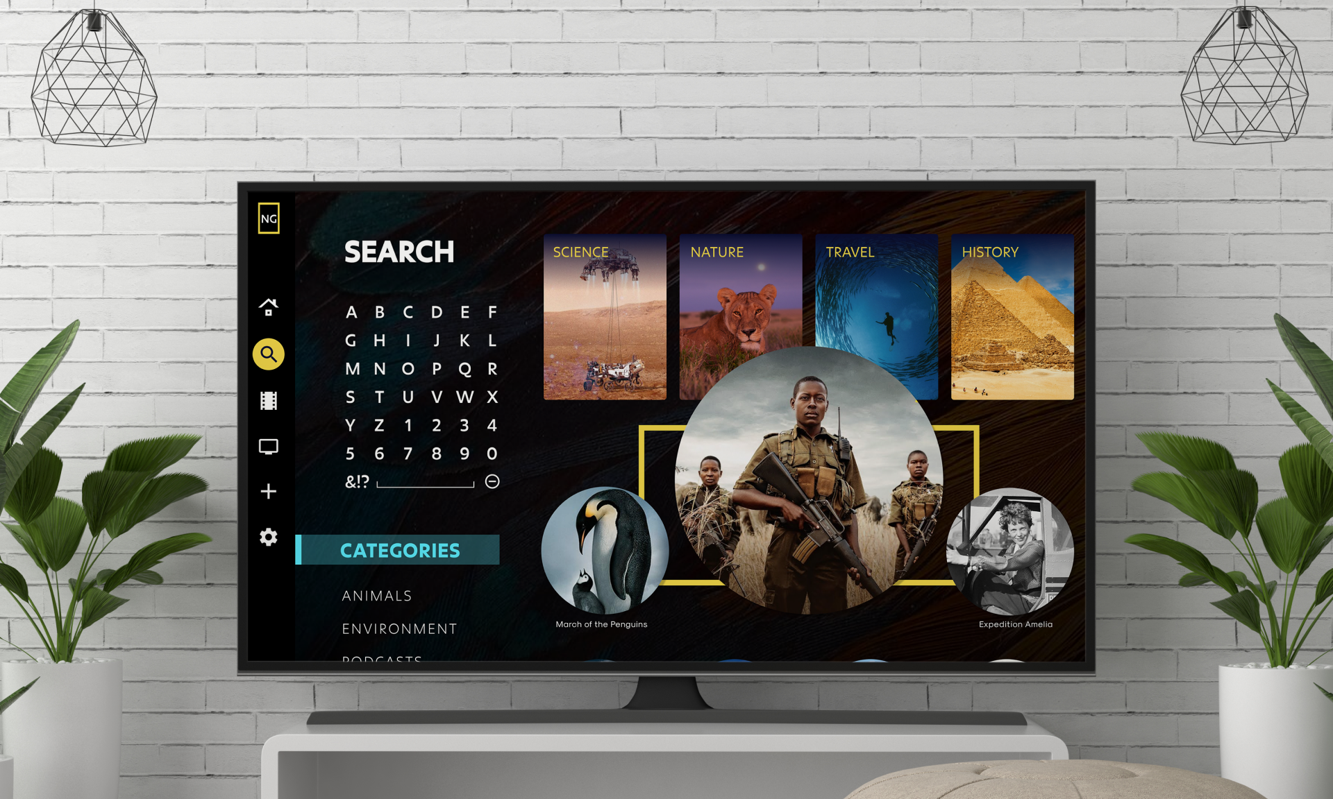
Search feature – provide a dynamic search section to encourage discovery and exploration
Bold design – develop a visual voice with strong shapes, colors, and typography
Video & movement – integrate videos and movements to welcome viewers into the Nat Geo portal
Design Language
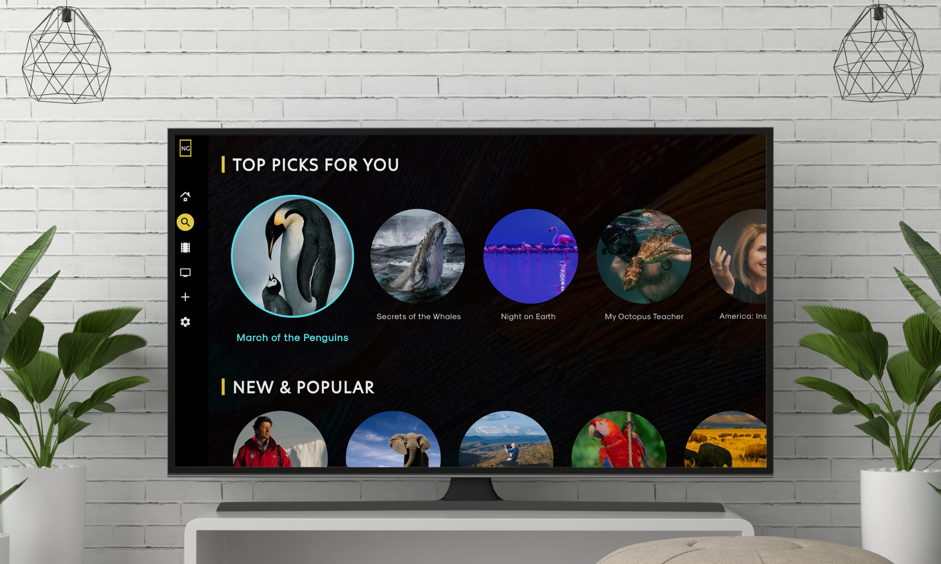
By incorporating circular elements alongside the brand's iconic yellow border, my design aims to achieve a more contemporary aesthetic. This approach also helps differentiate the app from competitors who often utilize rectangular content presentation and create a welcoming environment.
Moodboard and a sample of the style guide
Television App Redesign
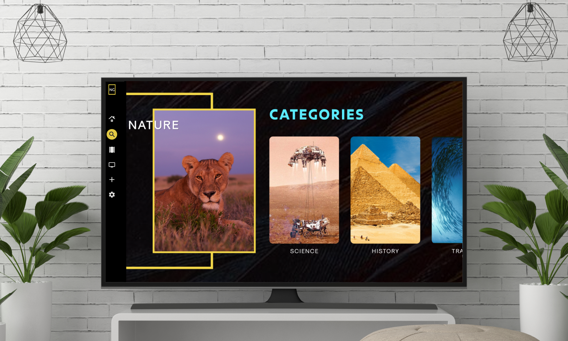
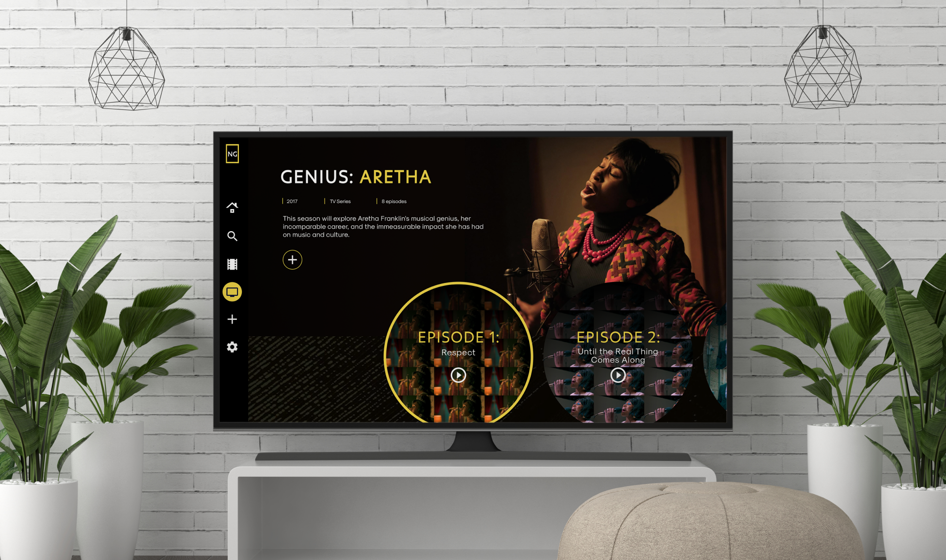
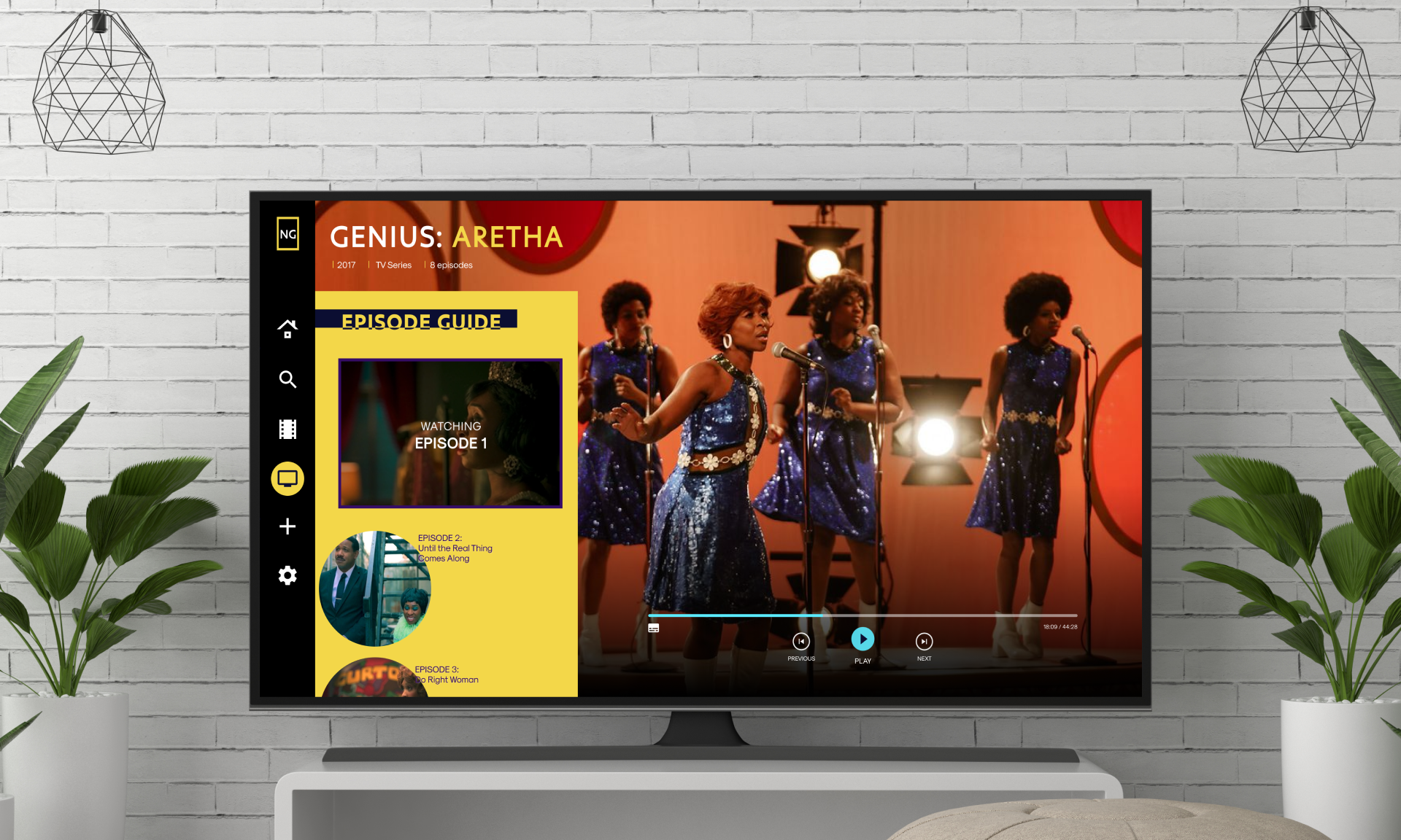
When opening National Geographic's TV app, users would be greeted by a dynamic homepage. A dedicated "Featured" section would showcase the latest must-watch content, perhaps highlighting inspiring women for Women's History Month. Clear headings and distinct layouts would guide users in their exploration.
This design also empowers users to discover unique programs through curated categories, personalized recommendations, or a powerful search bar. Whether users crave documentaries or thrilling series, the intuitive navigation sorts content by type, making it easy to find their next adventure.
Prototype
After designing the screens in Figma, I used Adobe After Effects to create motion graphics and make the interface elements come to life and Premiere Pro stitch the screens together.
The video demo below shows the user journey from opening the television app, exploring content on the home screen, selecting a series and episode to watch, and finally searching for additional content to watch.
