MY ROLE
As project and UX lead, I managed the redesign from start to finish and developed the Drupal-based website.
Here's how I facilitated the process:
• Led research initiatives like user interviews and card sorting sessions to gain deep user insights
• Collaborated with designers on wireframes and mockups based on research findings
• Worked with stakeholders to maintain open lines of communication and ensure project success
THE CHALLENGE
Students, families, and university staff struggled to find information on the Resident Life website because of its complex navigation, outdated design, poor mobile optimization, and lack of brand alignment.
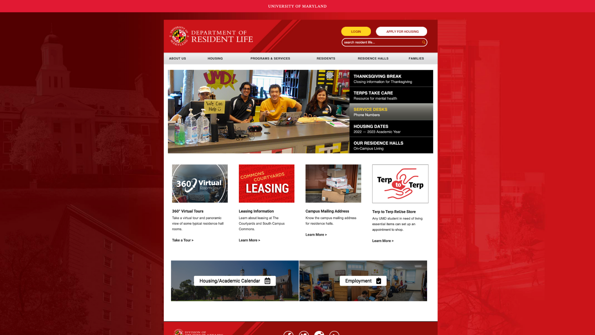
Home Page
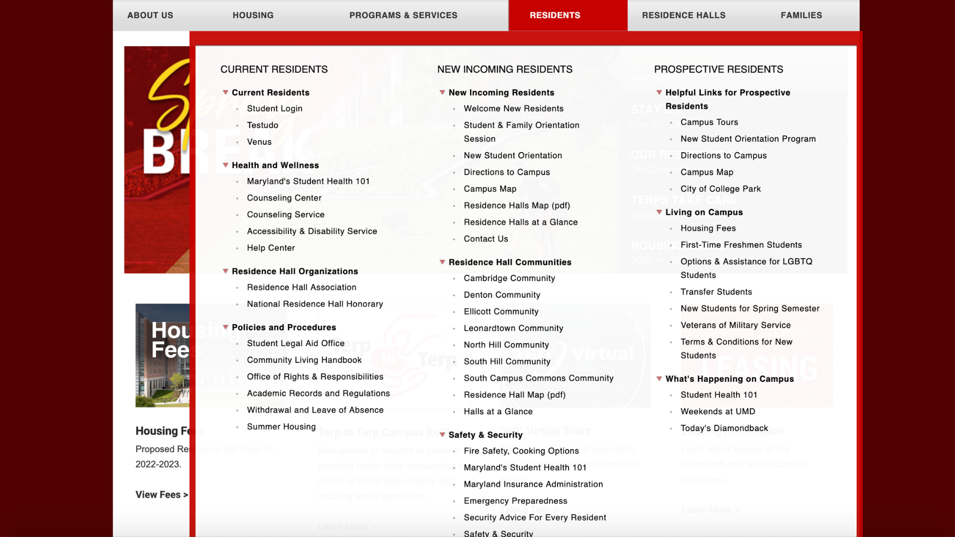
Sub Menu
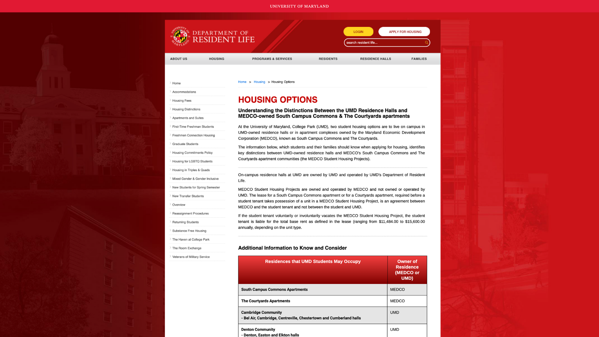
Secondary Page
“To get to the information you're looking for, you have to do a lot of clicking to get around.”
THE RESEARCH
I interviewed a diverse group of 12 students – first-year students, returning students, international students, and even alumni – to gain insights into their experiences with the Resident Life website.
Key pain points:
• Navigation frustration – too many tabs and clicks
• Information overload – struggle to locate details
• Visual disconnect – lack of engaging visuals and emotional connection
• Complex processes and technical language – confusion and limited understanding
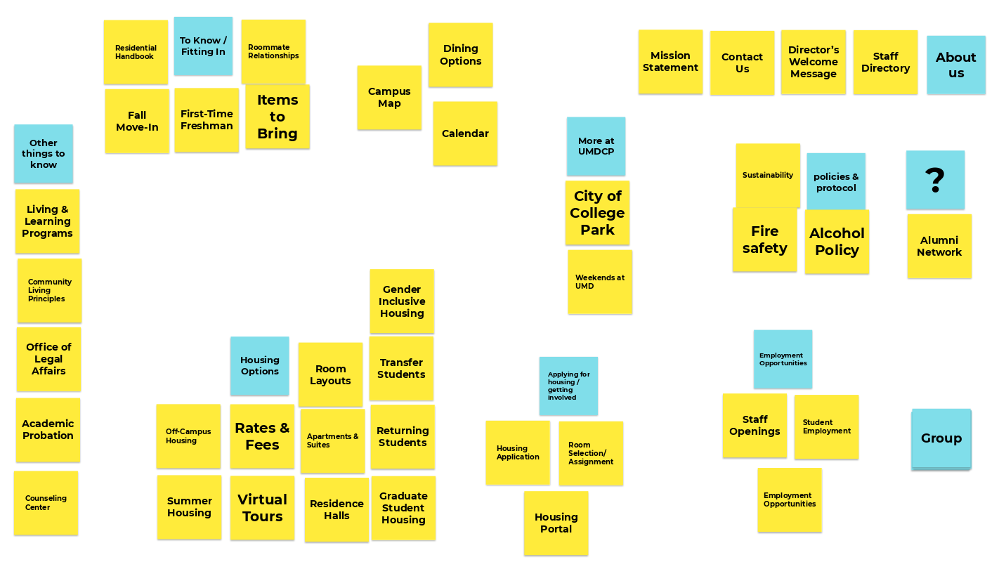
Card Sorting
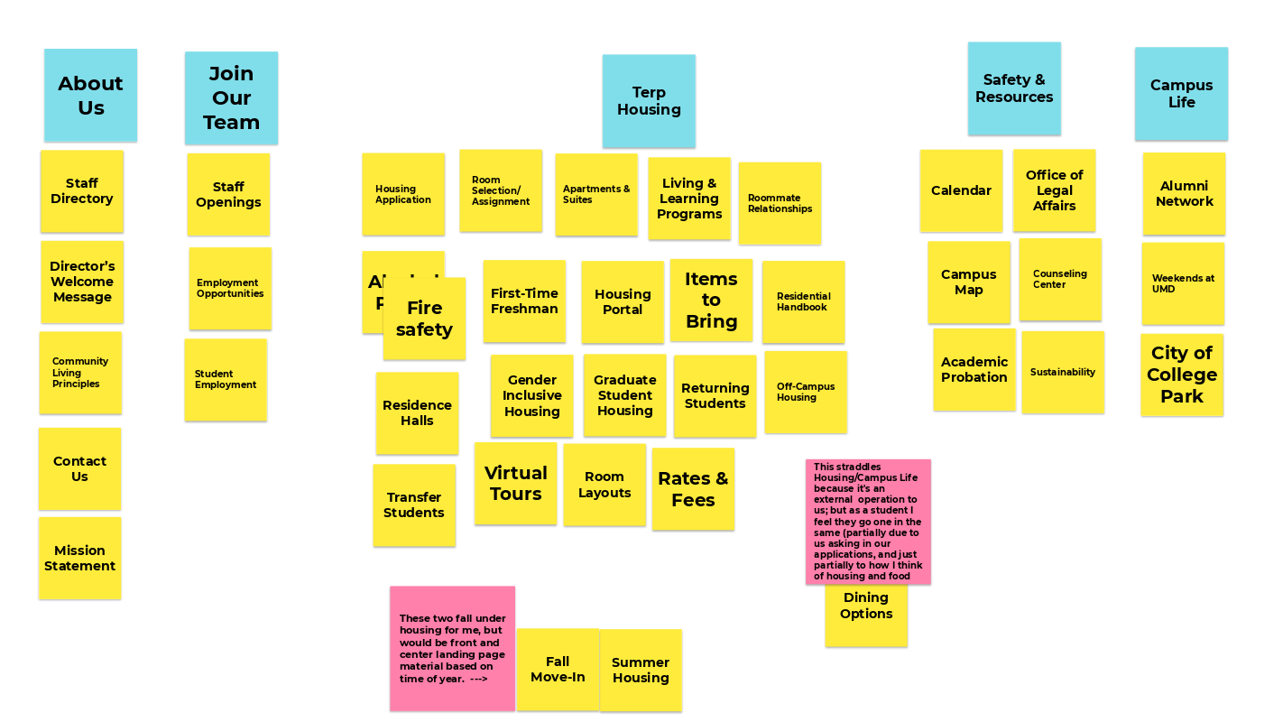
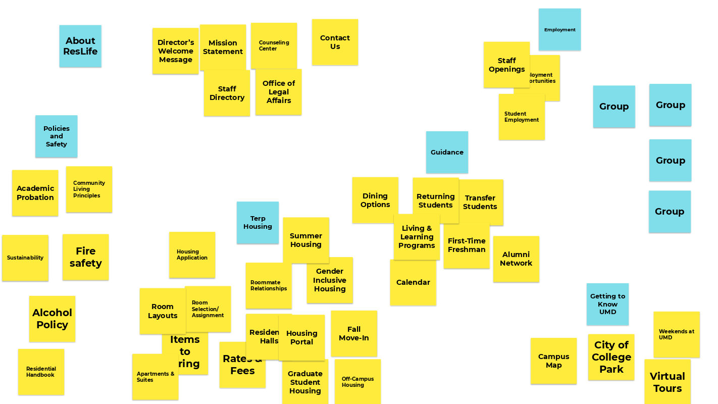
I held virtual card sorting sessions with 8 students and 11 leadership team staff to understand how people categorized information on the website.
I used Google Jamboard since it's free, supports remote participation, offers multiple workspaces, and allows for easy organization and categorization of information.
Similarity Matrix + Tree Testing
I analyzed the card sorting results using a similarity matrix to identify how users grouped information and to determine the optimal menu structure. This aided in creating a user-friendly and intuitive information architecture.
Building upon the card sorting results, I validated the proposed website menu structure through tree testing sessions with students and staff.
THE SOLUTION
Content Refresh
Instead of designing pages in isolation, I took a content-first approach.
Through user research and information architecture exercises, I identified and eliminated redundant content. This resulted in a 50% reduction in website pages, going from over 180 pages to a more manageable and focused 90 pages. This streamlining allowed users to find information quickly and efficiently.
Updated Design
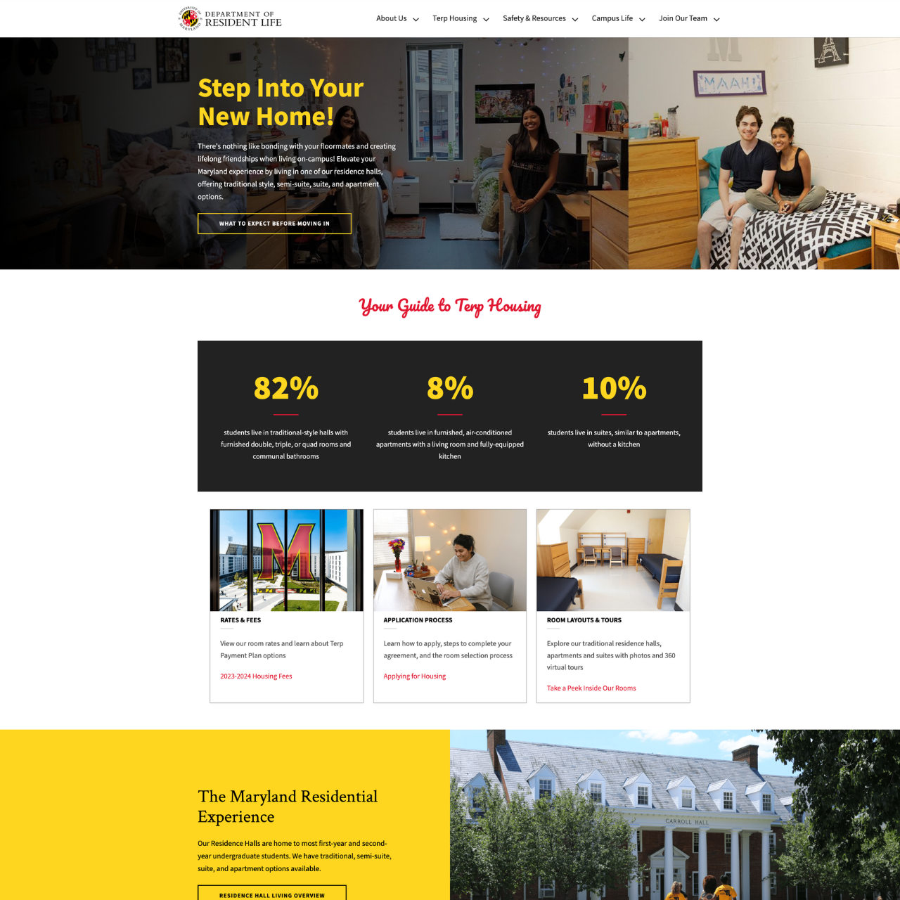
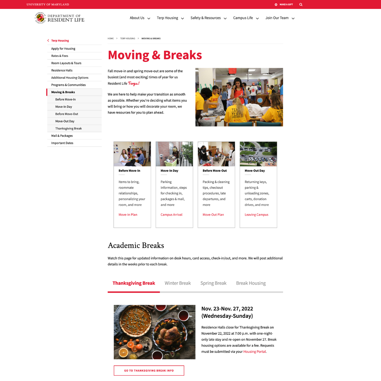
With a clearer picture of the information hierarchy, I developed pages on Drupal using the extensive library of widgets available within the university's design template to create visually engaging and scannable content.
I conducted focus group sessions with Resident Hall Association (RHA) students and departmental units to gather feedback on the visual direction and overall user experience.
The response from the focus groups was overwhelmingly positive:
• Improved visuals – great use of white space and engaging imagery
• Better communication style – tone and voice matched expectations
• Clear information layout – easy to find information from landing pages
THE RESULTS
By prioritizing user needs and involving them at every stage, we achieved significant improvements:
• Smart Brevity & plain language: Streamlined content through editing for clarity and conciseness, making information easier to understand and consume.
• Intuitive navigation: Implemented a clear and user-friendly navigation menu, allowing visitors to find the information they need quickly and effortlessly.
• Engaging visuals: Enhanced the website with captivating visuals that emotionally connect with the audience and promote the Resident Life department's brand.
• Mobile-responsive design & built-in accessibility: Upgraded the hosting platform and utilized the university's responsive and accessibility-focused template to ensure the website is inclusive and usable.
• Unique visual identity: Incorporated custom code elements, like a distinctive 404 page, to establish a unique visual identity and make the Resident Life department stand out within the university.
• Data-driven decisions: Implemented improved analytics tracking to measure user engagement and website performance.
Lessons Learned
The Resident Life website redesign wasn't without its challenges.
During the migration from Universal Analytics to Google Analytics 4, our analytics were down for the first few months and troubleshooting took some time. This meant we missed out on valuable user data. Next time, I'll prioritize having website tracking up and running from day one.
I'll also plan more carefully for URL changes to avoid broken links and minimize disruption for users.
